Radar Charts
Summary
Displays current snapshot or data over time? Current snapshot
Source data: Field (or metric)
Description: Similar to a Pie Chart, but with wheel spokes (like a star) rather than wedges
Use case example: Count of Companies, split by Owner
Who is this article for?
Planhat Users who are designing Dashboard and Presentation Pages (e.g. CS Ops)
What are Radar Charts?
Radar Charts are a type of "Share Chart", the same group as Pie and Doughnut Charts.
They are useful to show see relative sizes - e.g. which is the most common (and least common) Company Phase, or Churn Reason, or Conversation Type.
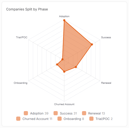
Radar Charts look web-like, with wheel spokes (like a star) for each category value. The numerical value (count, sum or average etc. - see the setup instructions below) for each category value is plotted on its spoke.
Different Radar Charts can have different numbers of spokes (points of the star) - it just depends how many possible category values there are.
Why use Radar Charts?
Like Pie and and Doughnut Charts, Radar Charts are part of the "Share Charts" category, and are great for giving you a quick view of:
A snapshot of current data
Splitting data up based on qualitative categories
More of a focus on relative proportions than absolute values
Radar Charts make it easy to spot trends and outliers in the data. They can be good for displaying a large number of category variables.
The use cases have a lot of overlap with those of Pie Charts and Doughnut Charts - for example:
Count of Conversations, split by Type
Count of Tasks, split by Status ("overdue" / "not yet due" etc.)
Count of Companies, split by Owner
Count of Companies, split by Health Score
Count of Churn, split by Reason
Company model - sum of ARR, split by Phase
Company model - average Health Score, split by Owner
We bet you can think of even more examples!
How to set up a Radar Chart
The main steps are:
Choose a data model (object) - e.g. Company
Choose either:
Counting the number of records - e.g. number of Companies
Or a property (from a choice of metrics and fields) plus an operation (sum, average, max or min) - e.g. sum of ARR
Choose what category property defines the spoke - e.g. Company Phase
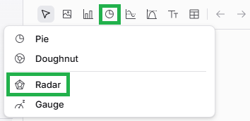
If you want to go back and edit your Radar Chart later on, it's easy to do so. While viewing the Page in Edit mode, mouse over the Widget (Chart), and click on the pencil icon to open up the Widget setup form again.
Comparison with other Widgets
Radar Charts are most similar to Pie Charts and Doughnut Charts, which are also part of the "Share Charts" group. In all cases, you see category values arranged from biggest to smallest, making it easy to identify the most "popular" category value.
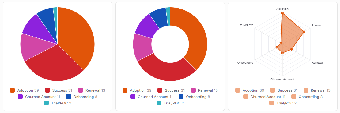
However, Pie and Doughnut Charts are better at looking at proportions (e.g. is one category value 25% or 50% of the whole), whereas Radar Charts are a bit better at visualizing outliers.
Another difference is that you can configure custom segments in Pie and Doughnut Charts, but you can't in Radar Charts.
Here is the same data displayed in a Pie, Doughnut and Radar:
Click the image to view it enlarged