Vertical Stacked Bar Charts
Summary
Displays current snapshot or data over time? Current snapshot
Source data: Field (or metric)
Description: Like a Vertical Multi Bar Chart, but with the second property defining bar segments rather than individual bars within a group
Use case example: Count of Companies, split by Owner and Phase
Who is this article for?
Planhat Users who are designing Dashboard and Presentation Pages (e.g. CS Ops)
What are Vertical Stacked Bar Charts?
"Vertical Stacked Bar" is part of the "Bar Charts" group, all of which show a snapshot of current data (as opposed to bar charts within the "Trend Charts" group, which show data over time).
Vertical Stacked Bar Charts are similar to Vertical Multi Bar Charts - you split numerical data (e.g. sum of ARR) by two properties (e.g. Phase and Owner) - but with stacking (bar segments) rather than multiple bars for the second property. Using a Vertical Stacked Bar Chart, you can easily see the overall category totals. You can also think of them as like a Vertical Single Bar Chart but with the bars segmented based on an additional property.
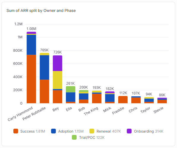
You can additionally convert a regular Vertical Stacked Bar Chart into a "100%" version. In this variant, rather than the chart primarily looking at the totals - what the biggest bar corresponds to, and so on - now all the bars are the same size (100%), and instead the proportion of the bar segments is what you're analyzing. Here's the same data as the chart above, but in a 100% Vertical Stacked Bar Chart.
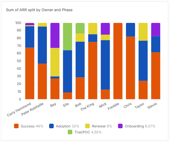
Note that the Stacked Bar Chart only exists in vertical form - there is no Horizontal Stacked Bar Chart (although technically you can make a horizontal version of the "100%" variant by creating a Horizontal Multi Bar Chart and selecting the box for 100% Stacked).
Why use Vertical Stacked Bar Charts?
As we mentioned above, Vertical Stacked Bar Charts split numerical data (e.g. sum of ARR) by two properties (e.g. Phase and Owner), so they have similar use cases to Multi Bar Charts (as well as Matrix Charts and Metric Tables).
However, because in a Stacked Bar Chart each bar always consists of segments added together to form totals, it only really makes sense to select "sum" or "count" as the operator, because the individual sums or counts will be added together to form the bars.
For example:
Count of Companies, by Owner and Phase
Sum of ARR, by Region and Salesperson
Vertical Stacked Bar Charts are perfect for use cases when you want to see overall totals/rankings, but also with some further detail. So, for example, you want to plot count of Companies on the y axis, have bars corresponding to Company Owners (the x axis), and have these bars segmented by Company Phase.
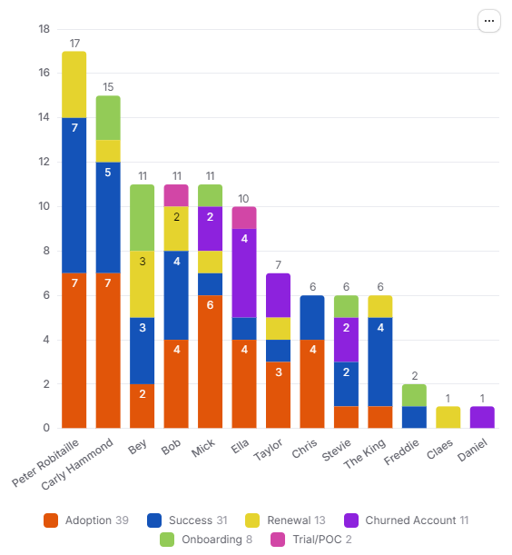
Using this chart setup you can quickly and easily say who in your team is managing the highest number of Companies, as well as get an indication of the proportions of Phases across the portfolios. For instance, maybe Sarah is the Owner of the highest number of Companies overall, but your chart shows that a lot of them are already onboarded; whereas Ravi is managing fewer Companies, but most of them are in the Onboarding Phase, where they required the most contact time.
If you particularly want to focus on the bar composition (e.g. how much of each Owner's Companies are in each Phase, in the example above), then use the "100%" variant.
How to set up a Vertical Stacked Bar Chart
The main steps are:
Choose a data model (object) - e.g. Company
Define one axis (the numerical axis) by choosing between:
Either counting the number of records - e.g. number of Companies
Or a property (from a choice of metrics and fields) plus an operation ("sum" is recommended for this chart type) - e.g. sum of ARR
Define the other axis by choosing a category property - e.g. Company Phase
Choose another category property to define the bars segments
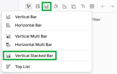
If you want to go back and edit your Vertical Stacked Bar Chart later on, it's easy to do so. While viewing the Page in Edit mode, mouse over the Widget (Chart), and click on the pencil icon to open up the Widget setup form again.
Pro tips
As we have mentioned elsewhere in this article:
You can configure "Custom Segments" (custom bar segments) if you'd like to group certain category values (bar segments) in together, with your choice of labels (names) and colors - e.g. if bar segments correspond to different Phases, you could "bucket" these into pre-sales v. post-sales
You can add a "Reference Value", which can be handy for benchmarking/targets
You can convert your regular Stacked Bar Chart into a percentage-based variant, where all bars are the same size and the proportions of bar segments are highlighted
Remember that "Split by category" defines the x axis, and "Group by" defines the bar segments. When you know the two qualitative/category properties you want to plot, try experimenting with swapping between which is "Split by category" and which is "Group by" - for example:
Click the images to view them enlarged
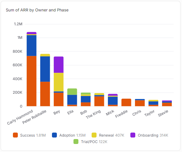
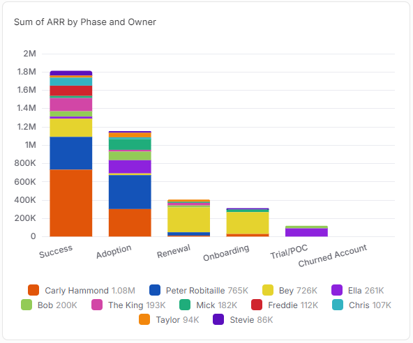
Note that you can't select the same property to be both "Split by" and "Group by" at the same time, so if you would like to swap the properties over like in the example above, you first need to deselect one (by selecting "-" in the dropdown list) before you can select it in the other dropdown.
Comparison with other Widgets
Vertical Stacked Bar Charts have a lot of similarities with Vertical Multi Bar Charts - the functionality, use cases, and method to configure the charts are basically the same. The only difference is that rather than the additional property corresponding to segments of the same bar, in a Multi Bar Chart, they are individual bars. This means that:
Stacked Bar Charts are perfect for showing the total of the whole category (axis property)
This means they are great for plotting "count" or "sum" data
Multi Bar Charts are better when you want to see relative sizes
This means they can also be good for showing "average", "max" or "min"
Here's the same data displayed in a Vertical Multi Bar Chart (at the top), a standard Vertical Stacked Bar Chart (in the middle), and a "100%" Vertical Stacked Bar Chart (at the bottom). You can see the same configuration in the setting on the right of each image.
Click the images to view them enlarged
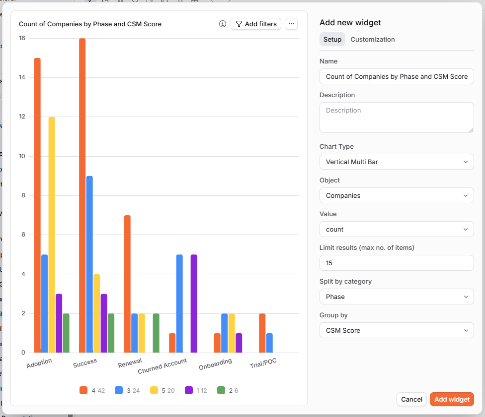
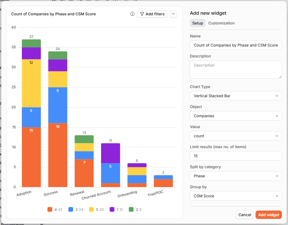
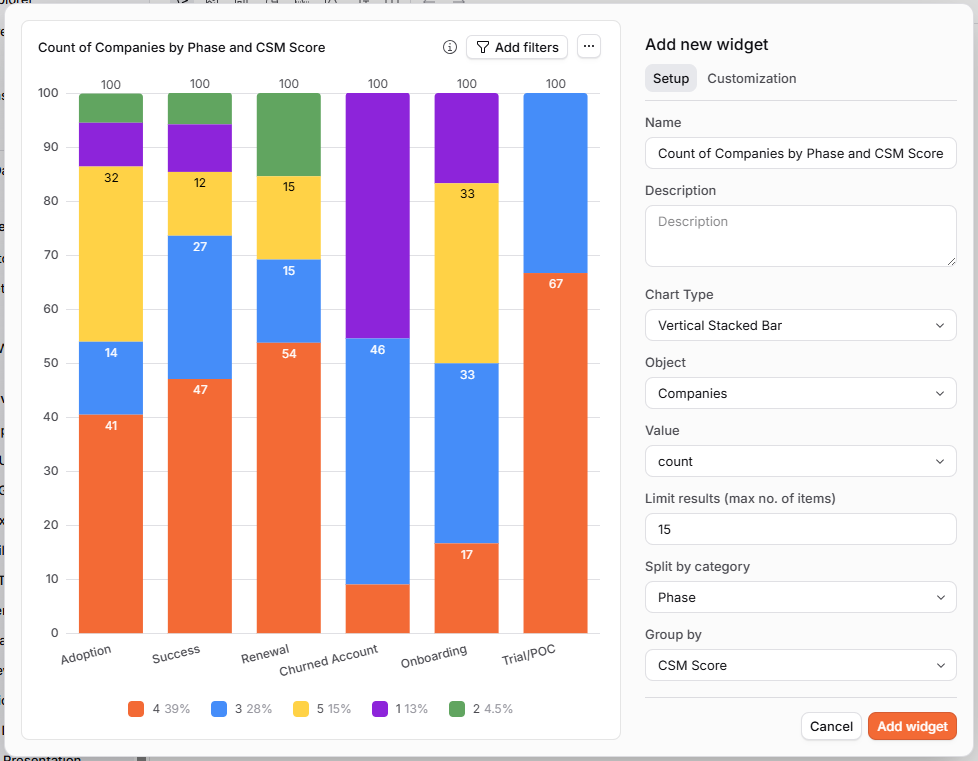
(You can't directly add a "Horizontal Stacked Bar" - although you can create a "Horizontal Multi Bar" and then select the "100% stacked bar" checkbox to turn it into a horizonal percentage stacked bar.)
The 100% Stacked Bar variant has some similarity to Pie Charts and Doughnut Charts.